
news.example.com
Why some pages are hard to read
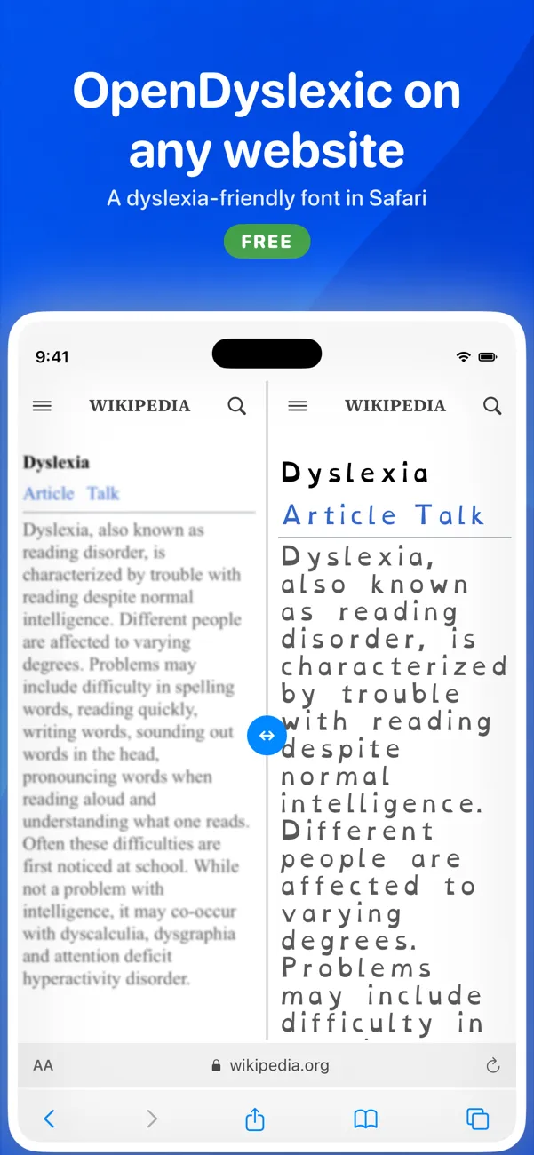
Many websites pick thin, small type with tight lines to look sleek. For readers with dyslexia, low vision or tired eyes, that styling turns a short article into hard work.
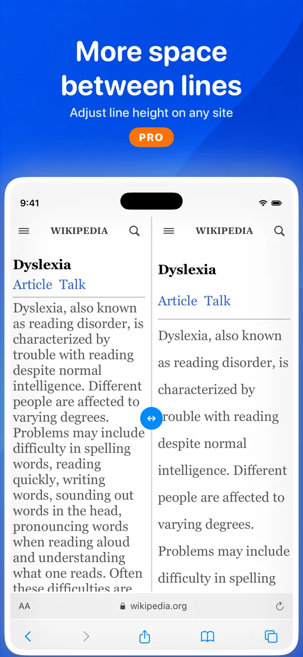
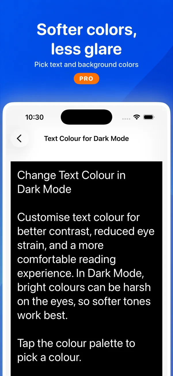
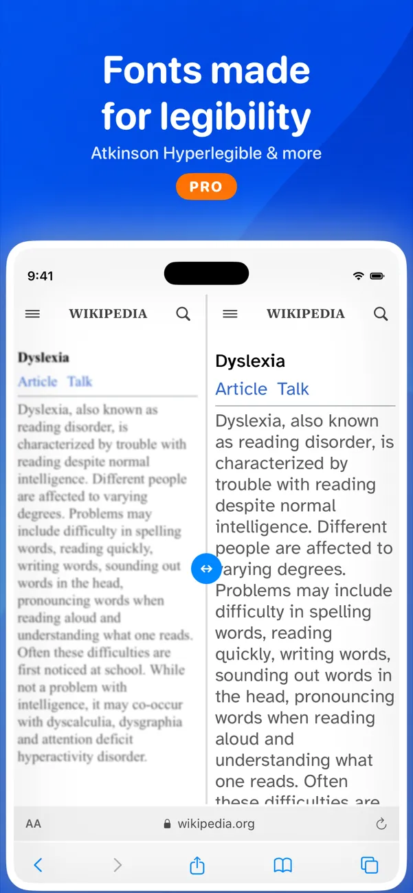
A clearer typeface, a little more space between lines and letters, and softer colors can make the same words feel calmer. The best settings are personal, so try a few.